Below you will find texts and essays about and surrounding Olle Bærtling’s artistic practice.
Texts
Essay by Gunnar Berefelt
How an aesthetic object loses its physical existence and evaporates as an immaterial play of forces or A meager attempt to identify a few means in Olle Bærtling’s art without mentioning a word about its poetry and magic.
It is difficult to write about Olle Bærtling’s art. Those who do not understand become angry because it seems complicated; those who do understand may become angry because it is too simple. The easiest would be to refrain and keep the enthusiasm to oneself. But I am spurred by a desire to have more people share my appreciation.
The difficulty in describing his art lies in its total simplicity, or rather, purity. There are no anecdotal circumstances to refer to and thereby superficially capture attention. It is not a matter of objects that are interesting or appealing because they evoke interesting or appealing ideas. (This is still how the majority of art works for most viewers.) You cannot lead people to understanding through shortcuts over sensational biographical deeds. There is not even material for daydreams or moral lessons.
This art represents nothing. It just is. It is not about something. It just acts. It is completely naked, stripped of all extraneous matter. Thus, its references are extremely limited, its scope very restricted. It is a highly demanding art. It requires to be seen and understood with the eyes.
Either you see and realize, or you understand nothing. Tellingly, Bærtling’s audience seems to consist of two camps: the enraptured and the detractors. You cannot like this half-heartedly, half-seen and half-understood. This art must hit directly and then with tremendous precision; like the incision of a scalpel. Either revelations – or nothing.
It is about displaying visual concepts. It sounds like a contradiction: ‘visual’ has to do with the senses, ‘concepts’ with thinking. The senses register what is present here and now. Concepts are abstractions, usually generalizing summaries of a series of concrete experiences. Within our culture, too much has been made of the contradiction between sense and intellect. We must count on sensory intelligence!
This art requires us to be able to comprehend with our eyes and see with our understanding. It concretizes dynamic concepts such as ‘force’, ‘struggle’, ‘tension’, ‘movement’, ‘energy’, ‘condensation’, ‘dilution’, ‘approaching’, ‘receding’, and much more. It makes these concepts visible before our eyes without references via motifs and symbols as intermediaries.
To make the form act purely visually with such sparse means is a feat. All or nothing.
Bærtling coined the term ‘open form’. No one has so consistently practiced the aesthetics of open form, and this earns him a place among the innovators in the history of art. (The biggest mistake with O.B. has been that he is Swedish.)
Let me give some extremely simplified school examples of means in his art after 1953:
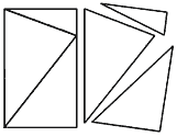
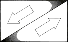
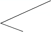
We divide a rectangle using two lines so that we get three triangular parts, of which the middle one will play the lead role. The three triangles within the given square appear as closed geometric figures defined by the lines and by the boundaries of the surface.
For Bærtling, these triangles became all too materially tangible, too bound as ‘objects’ precisely as triangles. They easily appear as things; and there is no greater difference, he argues, in reproducing triangles and other geometric figures or flowers, landscapes, nude women, boats, etc. endlessly. It is just a matter of different motifs. Even supposedly non-figurative art often presents figurations on a surface.
Bærtling has achieved a sovereign independence from things, from pictorial fiction, from associations.
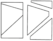
Let us return to our illustration. Instead, we let the two lines pass through the surface without meeting. The lines continue outside the frame, which now appears as a temporary limitation. The action fields of the lines and surfaces have significantly widened. What is visible indicates a continuation, a further unfolding beyond the surface of the picture. The triangles have become halfway defined surfaces with unlimited reach. What we see is a snippet of a power play that presupposes a space beyond the narrow confines of the canvas.
Even a characteristic like balance (here = equilibrium between conflicting forces) presupposes a consideration of, a feeling for the continuation of the components beyond the image. (Note that O.B. continues his painting a few millimeters around the corner, onto the edge of the stretcher frame, foregoing a frame and placing the canvases slightly in front of the wall. This is to lift the usual limitation of a painting and mark the function of the image in a broader spatial context.)
Even color contributes to counteracting limitation. It is not there to delineate surfaces. Somewhat pointedly: the color in Bærtling’s paintings must not be perceived as color, for if so, the effect of immateriality is nullified.
His colors are deliberately inorganic. ‘Normal’ shades of brown, green, blue, yellow, red, etc. could easily be associated with notions of earth, land, forest, meadows, sky, sea, blood, and much more.
These colors do not clothe figures; they indicate spheres. They do not define; they open. They are essentially non-color, only meant to indicate the degree of density in the space they control.
The lines are important. They direct the action. They are not drawn with a ruler but always make a slight deviation adapted to the mass of the surfaces they separate. The lines vibrate – hence the vitality of the fields of force they intersect.
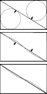
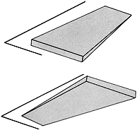
Where the triangular surface is widest (more accurately, where one can inscribe the largest circle), the sphere seems to ‘dilute’ (the color somewhat lighter). Approximately at the point where the imaginary circle touches the boundary line (-lines), the surface appears to expand, causing a straight line to appear slightly curved at this point.
To counteract this and apparently straighten out the line, Olle Bærtling lets it curve inward toward the surface. (Exaggeratedly clarified in the adjacent illustration.)
Even at the angular tips where the surface ‘densifies’ (the color appears darker), such expansion occurs, requiring modulation of the line to make it appear straight.
Arguably the most striking and active effect in Bærtling’s art should be emphasized: the border contrast. When two colors have a sufficiently long and distinct demarcation, they seem to alternately penetrate a piece into the domain of the neighboring color. Right at the boundary line, the two color fields oscillate, flicker. We get a similar effect in the sculptures, where the ‘spheres’ appear to vibrate along the demarcation lines, and the ‘overlaps’ vary depending on the angle and the deviation of the lines (i.e., the steel tubes) from absolute straightness.
The effect likely has to do with a certain ‘inertia’ of vision: Even when we think we are staring fixedly at a certain point, the eye moves in small jerky (normally, and fortunately, imperceptible) movements. But these micromovements can sometimes give the brain somewhat contradictory messages from the retina, especially when we carefully observe simple and clearly demarcated surface markings that do not depict anything and are difficult to interpret as a figure/ground relationship.
If one divides a rectangle vertically or horizontally with two color areas, one gets such an overlap evenly across the entire boundary line. But here, we are dealing with ‘open’ triangular – rather ‘angular’ – surface indications. Where two lines converge, the color appears darker; and where the diverging lines leave the canvas, the color appears lighter. (Note that the color is exactly the same across the entire surface. It is the viewer who perceives the darker where the surface is drawn together towards the angular tip and lighter where the surface expands.)
At the angular tip, where the color appears darker (the surface densifies), the overlap is intensified (through border contrast), creating a pulsating movement, a flow of color from the tip towards the opening of the angle. Here, an optical contradiction is indicated: A triangle indicates movement in the direction of its sharpest angle. But the densification of color towards the point of convergence creates movement in the diametrically opposite direction.
This contradiction (or perceptual ambiguity) in the plane is complicated by a similar contradiction in space. Because lines also indicate space; so do colors. Two parallel lines appear to approach each other as they move away from the viewer (this is called perspective). The intensity of a color decreases with distance from the viewer (this effect is called aerial perspective). Lines and colors can provide conflicting information about space. Converging lines point away, diverging ones point towards. Lighter color recedes, darker color advances.
This means that we see a sphere approaching where the color densifies towards the smallest angle of the surface, which graphically (linearly perspectivally) recedes. And vice versa: where the diverging lines leave the image, a starting point (a ‘here’) for the viewer is graphically formed, but simultaneously a distancing (a ‘there’) because the color thins out.
It is entirely consistent that Bærtling has moved the black lines out of the paintings to project them into real space as sculpture. In fact, it is not at all a question of ‘sculpture’ in the conventional sense, as they are not intended as plastic objects. The metal rods are indeed three-dimensional objects, but they should be perceived as lines, etched in free space. They are agents in a process, and Bærtling works as a draftsman with space as his substrate.
Olle Bærtling, Xu, 1968
When one walks around a three-dimensional object (for example, a traditional sculpture), each aspect contains a summary of all other possible viewing points; each new aspect confirms the appearance of the object in space.
But a sculpture (one should say ‘spatial drawing’) by Bærtling should be seen as a uniform object from every aspect, totally independent of all other appearances.
Volume and spatiality in a Bærtling sculpture are essentially illusory properties insofar as qualities such as ‘space,’ ‘depth,’ ‘direction,’ ‘movement,’ ‘compression,’ ‘dilution,’ and other sensory properties are processed and interpreted by the viewer. And these interpretations are relatively independent of learned or environmentally conditioned cultural heritage but rather have to do with sensory physiology. (The tendency to make an effort to see this, however, is culturally anchored.)
In his sculptures, he goes even further in concretion and simplification because the colors have been replaced by ‘air.’ Space is his material.
The crucial characteristic, the carrying effect, can be associated with our way of perceiving angles. It seems that the right angle (90°) constitutes a kind of norm for our perceptual interpretation of angles. As an optical pattern, the right angle is structurally simpler than all other angles (which can occur in a triangle). Because vision, among other things, has evolved to perceive bodies in space, we are inclined to interpret deviations from the right angle as perspectival deformation and consequently as spatial indication.
For example: if we see two lines meeting at a 50° angle, it is easy to perceive this not as a part of a triangle but as a right-angled corner of a rectangular surface. The deviation from the 90° norm makes one perceive the surface indication as spatial marking. Moreover, this spatial marking is ambiguous because the surface can be perceived as alternately falling towards or away from the viewer.
As mentioned earlier, angles indicate direction in the surface, and the movement is directed by the angle’s bisector (= the imaginary line that divides the angle into two equal parts). The sharper the angle, the faster the movement. But this direction is also counteracted in the sculptures by a diametrical movement as soon as we perceive the lines as marking the surface in space.
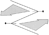
These counter movements are further complicated if one divides a line into two opposing angular tips; we then get two implied triangles with an ‘open’ front and with a common side. Two surfaces share a dividing line. And then there’s a conflict. Because the Siamese line points either to the right or to the left depending on which surface it currently appears to bound. Not only that – it also separates two spheres that alternately change direction and position, approaching or receding…
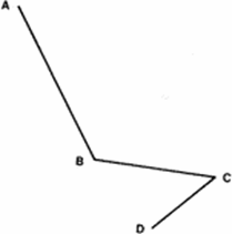
Points A-B-C indicate corners of an implied surface (I)
Points B-C-D indicate a corner of an implied surface (II)
Examples of positions in one of many possible appearances:
1) Point B is closest, surface I recedes from the viewer, point A is farthest. C recedes, D approaches, surface II is seen from above.
2) Point B is farthest, surface I approaches the viewer, A approaches. C is closest, D recedes, surface II is seen from below.
These opposites create a tremendous dynamism that for some may appear disharmonious and challenging. But here lies a tense balance, a harmony of higher order, apparent to those who take the time to contemplate what happens beyond the markings (painted on canvas or cut in steel).
The interplay between opposites, constant counterplays, is what is visible. Disharmony is a principle and starting point for the physical presence in these objects. But let the form work. Also consider what lies beyond! Ultimately, opposites reach a balance: these ‘either-or’ are really a ‘both-and,’ contradictions become a confirmation of the diversity of possibilities and a harmony ‘nevertheless.’
Being is constantly becoming. Nothing in this existence is permanent except impermanence, change. So philosophized a Greek from Ephesus nearly 2500 years ago. His name was Heraclitus. A quote from his fragments could serve as a motto for Bærtling’s work: “Everything is in motion and nothing remains at rest.”
Gunnar Berefelt
Ph.D., Professor of Art History, Stockholm University
Essay by Oscar Reutersvärd
Bærtling’s sculptures
An actual boundary cannot phenomenally be drawn between the artist’s paintings and sculptures; Bærtling himself calls them “projections of the same design will into compositions in space.” Since the perceptual image in both his two-dimensional and three-dimensional works belongs to the realm of the non-sensory, a technical differentiation also becomes meaningless. One might also express it as the visions liberating themselves and transcending in the same way from both his painting material and the sculptures’ metal.
Therefore, the following retrospective account of the developmental path in Bærtling’s activity as a sculptor may, after reading Teddy Brunius’s summary, seem redundant. However, it is of inevitable interest to witness the gradual progressions of such a methodical genius’s work as Bærtling’s. These consistently alternating stages also constitute instructive examples of solving purely technical sculpture problems, forced by an inexorably expanding expressive will.
What makes these endeavors justified to be related in greater detail is not least that they concern an artist individual who has set the seemingly impossible as a goal – to transform eruptive emotional expression and constructive force into sublime expression – and succeeded in achieving this goal. In the following analysis, I can show how an artist, carried by true pathos and lofty idealism, without flinching from daunting obstacles, tamed the wild forces, purified the means of expression from all impurities, and shaped his own unique art of expression.
Bærtling’s first methodically executed works in metal and three dimensions were a series of sculptures with many variations, called “The Spirals.” They were created in 1954 (Spiro I 1954 H 102 cm, Moderna Museet, Stockholm). “The Spirals” were based on an impulse captured from the emotional self and resembled nothing of what had previously been produced in European constructive sculpture. They were intentionally, completely non-figurative.
“The Spirals” consisted of black-painted iron bands, a few centimeters wide, twisted into tubular, vertically ascending spirals, where the band at the top twisted out and ended as oblique flags. It was as if the broad Bærtling contour had freed itself from the paintings and risen into space.
These sculptures were partly intended to act as mobiles. An external force could cause them to pendulate in slow movements. And like all of the artist’s plastic works, they were merely models for monumental sculptures, intended to be erected in colossal format in open squares or expansive parks, where the wind could set them swaying.
Olle Bærtling, Spiro II, 1954
What’s interesting is the dual possibility of experiencing double movement that Bærtling already calculated in his compositions here: the experience of the “imagined” movement in the spiral’s upward winding, and the actual physical pendulum motion caused by the wind.
Despite these sculptures, as we’ve mentioned, being part of Bærtling’s non-figurative creation, they had an unavoidable organic character and acted like living organisms.
But Bærtling’s plastic creation, in the sense that we now understand it, truly began in 1956 with a sculpture that I see as revolutionary and epoch-making: “Cikva” 1956 H 54 cm. With this work, he elevated the problems in his sculpture to a high abstract level in one fell swoop – and beyond the bounds of the tangibly graspable. “Cikva” sprang from an objet trouvé. Bærtling had found and brought back to his studio an immaterial circle with a diameter of about half a meter. Or better described, his find was a thick, square iron plate, in which a circular hole was punched out almost to the edge.
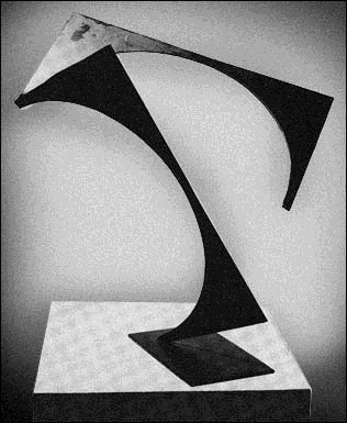
Olle Bærtling, Cikva, 1956, height 54 cm
To twirl a coin between thumb and forefinger is a classic show of strength. Bærtling, however, performed a sort of inverted test of strength here. He cut open one side of the iron plate and twisted the circular void into a quarter-turn spiral, where the spiral property became as unreal as the circular property of the thus deformed airspace.
In this strongly inspired act of creation, the geometrically fully determinable piece of iron was transformed before our eyes into a plastic monument with a spatial complication that couldn’t be grasped and defined discursively. The circle, recently inscribed regularly in the iron, was twisted out of its enclosure and brought into union and merger with free space. Better than this ascent of the circle into the masses of air and infinite expanse, Bærtling’s principle regarding the open form and the capture of space as an active compositional element cannot be demonstrated. Therefore, at the same moment the outer contour of the circle was shattered, the surrounding air became a compositional element without measurable boundaries in Bærtling’s creative direction. Thus, he established the fundamental intention for his entire future sculptural activity.
“Cikva” was, in some sense, organic; it bore much resemblance to “Spirorna.” But immediately after its creation, Bærtling discarded the entire organic morphology forever. The straight line and the straight direction of movement became his sole props.
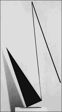
The compositions with flat sheets that he now began to cut out of the iron plate with the blowtorch inevitably had straight sides (Kereb 1956 H 132 cm, Moderna Museet, Stockholm). Their suggestive movements lined up straight directions. The sheets, which constituted pictorial elements, appeared as cubist toe dancers, silhouetted in black, propping themselves up with an angle against the base plate for gliding leaps into the air. These sculptures had taken shape from a shadow play of planar geometric shapes that dramatically extracted Bærtling’s compositional patterns from painting and transformed them into plastic composition.
It wouldn’t be long before Bærtling took the decisive step that would enable sculpture to adequately apply the formal system of the two-dimensional works and thus realize his thesis regarding the methodology of expression in his plastic art. This could be accomplished by abandoning iron as a material and turning to a more resilient and controllable metal, steel.
This transition was initiated by some works where the upward-striving iron plates were made to interact with upward-pointing steel rods. The introduction of the seemingly inconsequential rods marked the realization of Bærtling’s pursuit of immaterialized creation. Through the inclusion of the rods as interacting factors with the massive iron plates, triangular surfaces were constituted to the amazement of the beholder, where the iron seemed transformed and the very void had become the acting medium! Thus, Bærtling had begun his famous channeling of the masses of air and the infinite space in his sculptures.
Bærtling’s persistent endeavor to create the mysterious lift from the physical ground and the wonderful flight had been hampered by the heavy iron. This had a massiveness and a tangible object character that clashed with Bærtling’s esoteric visions and couldn’t be eliminated. With the slender steel ribs and their superior ability to form sharp lines in airspace, Bærtling found the technical solution.
Iron had also held him back in terms of dimensions. To direct a powerful flow of movement to great heights would require immense surfaces of compact iron. And in his calculations, Bærtling envisioned gigantic monuments that would rise hundreds of meters into the air (Kero 1957 H 265 cm, Tate Gallery, London; Siruk 1958 H 258 cm, Solomon R. Guggenheim Museum, New York; Sirur 1959 H 277 cm, Museum of Modern Art, New York).
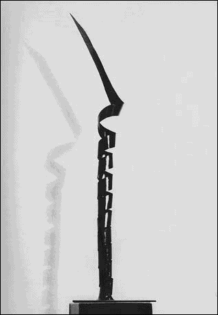
Olle Bærtling, Kerabk, 1957, height 208 cm
With the disappearance of iron from Bærtling’s production, the heavy force of his works was replaced by a more weightless energy, a hovering dynamism, an indescribable reservoir of imagination. Three important imperatives were now fully realized in accordance with his aesthetic dogma: simplification of forms, purification of sculptural means, and liberation of sculptural objects from physical dependence.
With this transition, Bærtling had come a long way on the path also trodden by Malevich, Mondrian, and Herbin for a long time. The path toward the artwork without object character and literal meaning, that is, the spiritualized creation.
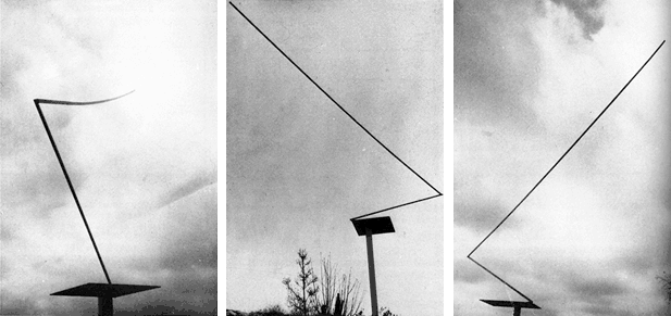
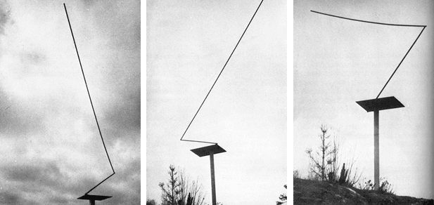
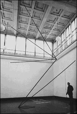
Another important innovation—regarding the way sculptures were placed—was made by Bærtling in the early 1970s. He diverted some of his works from the traditional display alternatives for sculpture monuments: on the ground, on pedestals and plinths, or other bases indicating stability and static existence. Instead, he raised them on tall, slender steel verticals, removing them from solid ground and lifting them into a region teeming with movement, among sliding clouds and tree tops swaying in the wind (Yz 1969 H 317 cm, Stockholm University).
Now, Bærtling had fully grown into his role as one of the great constructivists in Europe. He masterfully wielded his creative means. With the skill of a great master, he could now realize and visualize his vast internal, formless visions. At this time, Bærtling’s creative intentions were also fully conscious and defined by him. His works were to be much more than spectacular eye-catchers. They were to, with the power he infused into them, captivate viewers and carry them away. They were to hypnotically fixate humans on their theme of movement and inspire them to engage in an escapist interplay. Therefore, the right attitude towards Bærtling’s sculptures is to see them as objects of meditation tasked with pulling the individual out of the trivial context and into the contemplative state. Bærtling intends, with his works, to provide a kind of mind-altering energy for our drive towards transcendence.
With admiration, the observant viewer can see how effectively and seemingly effortlessly Bærtling “invisibly” charged these later plastic works with the activating force. Their themes of movement affect the willing in a similar way to the hypnotist’s imperceptible gestures. We follow the flight lines of the steel as far as they extend for our physical sight; thereafter, our desire to flee and our imagination take over, leading the observer further out into liberating, contourless regions. Bærtling’s sculptures of the 1960s and 1970s can be said to represent an “anticompositional” construction. With their character of hovering, weightless entities, they seem elevated above the classical rules of composition, such as the demands for proportional likeness, balance, and integration into wholes. Bærtling also doesn’t base his creative process on rational calculations and measurable modules. His staging of his spatial themes is a complex creation procedure of emotion and intuition. With emotional predominance, for example, he moderates the degree of sharpness or dullness of the angles and gives the form constellation the impression of greater or lesser flight speed. In a long series of works, he has turned steel constructions with extremely acute angles into formal catapults that propel the form components at lightning speed. Many of these have greater complexity. The angular forms are joined together in several dynamic centers, eliciting conflicting effects.
These spatial compositions not only emit radiation, i.e., they are perceived as constellations of forms that leave the sculpture in flight. They also contain “magnetic” centers that seem to draw “infinite” forms towards them. Particularly interesting are some examples from the 1960s with angles zigzagging into each other. Their motion pattern evokes the sensation of continuous forward and backward motion (Asamk 1961 H 770 cm, Archive for Decorative Art, Lund).
Olle Bærtling at Asamk, 1961, height 770 cm, at the exhibition “Aspect 61,” Liljevalchs Konsthall, Stockholm 1961. Photo: Lennart Olson © Hallands Konstmuseum
This association of movement is, of course, not absolute. The spectator’s placement and movement in relation to the monument change the sculpture’s configuration incidentally and thus its way of exerting effect. However, to reduce this margin of randomness, Bærtling took what seemed like a trivial but fundamentally very important new step in 1966.
His sculptures had hitherto been consistently three-dimensional, extending in all directions of space. He transitioned to a two-dimensional construction, where all the components seemed to lie on an invisible plane. With this new phase in the transformation process of Bærtling’s sculpture, a further step was taken in the artist’s pursuit of realizing the dimensionless creation. The degree of abstraction is undoubtedly heightened here; the sculpture exists through this planar geometric projection in a way that closely resembles a principle sketch drawn on paper (Yayao 1971 H 525 cm, Centre National d’Art et de Culture Georges Pompidou, Paris).
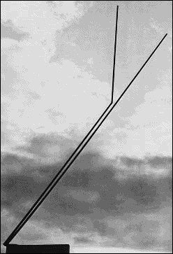
Olle Bærtling, Yayao, 1971, height 525 cm
I readily admit that I have constantly been guilty of the mistake of believing – and openly advocating – that Bærtling had pushed his creation to the maximum limit. Each time, I have been disproven by him showing that another step towards dizzying intensity has been possible for him to take.
However, in the face of today’s sculptures by Bærtling, it seems to me unquestionable that they represent a culmination in his creation that cannot be surpassed.
Oscar Reutersvärd
Ph.D., Professor of Art History, Lund University